Private Label · Home & Garden · S/S 2027
Spring 2027 Capsule: Cottage
Cottage Edition is a soft spring product story built around garden rituals, vintage florals and small objects that make everyday plant care feel personal. The direction updates cottage style for a cleaner retail setting. It keeps the charm of old floral ceramics, scalloped trims and handmade details, but gives them softer forms, clearer colour stories and a more polished finish. The result feels nostalgic, but not old fashioned. It is romantic, tactile and easy to place across spring, Mother’s Day and early summer assortments.
ROLE
Trend Research, Concept, Collection & Surface Design, CMF
BRIEF
Private Label
TIMELINE
2-week sprint


01 RESEARCH
The trend, the
direction & the brief
THE TREND
Consumers are looking for spring products that feel calm, personal and easy to love. Cottage style answers this with soft florals, rounded shapes, gentle colour and handmade detail, but the look needs to feel cleaner and more retail ready than traditional cottage décor.
THE DIRECTION
The focus is on rounded planters, scalloped rims, raised florals, soft speckled glazes and a few darker colours for depth. Each piece should feel collected and crafted, but still simple enough to work on a clear retail shelf.
BACKGROUND
From trend research to product renders, the capsule was shaped into a clear commercial range that gives retailers a ready direction for colour, form, surface detail and shelf storytelling.
+55%
TikTok growth for #biophilicdesign confirms stronger demand for nature led interiors.
+250%
Growth in restorative design signals demand for soft, calming and comforting home pieces.
+915%
Pinterest search growth for “dark cottagecore kitchens” shows that cottage style is moving into more mature home settings.


02 MOOD & MATERIALS
A palette from the spring garden


03 IDEATION & SKETCHING
From garden to retail


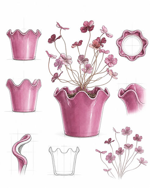
The collection should feel like a set of pieces found on a cottage windowsill, but designed with clear retail logic.
Start with one hero shape: the ruffled rim planter. This is the most commercial piece because it is simple, giftable and easy to repeat in different colours. Built the second family around rustic, cylindrical planters with scalloped collars and embossed stems.
These pieces will make the shelf more varied. I included the wavy rim vases as the decorative layer. They can carry polka dots, swirl linework or soft glaze effects. The range should not feel too matched. It should feel collected, but controlled.
Repeated the same flower shape, scallop edge and colour palette across different forms to hold the full story together.
04 PROTOTYPES & SAMPLES
Testing shape, glaze
and shelf appeal
Once the design direction is set, the work moves from concept into production development. I send the drawings, renders, colour notes and finish references to the team in China, then coordinate with the factories through the mould stage. At this point I advise on every detail, from shape and proportions to face placement, glaze finish and shelf presence, so the samples stay true to the original design before I approve them for mass production.


DESIGN HANDOVER
Sending the full design package to China, with drawings, renders, colour references and notes that explain the feeling each piece needs to keep.
MOULD STAGE
Working with the team and factories while the moulds are built, checking proportions, openings, feet, rim details and character features before sampling moves forward.
FINAL APPROVAL
Reviewing the bisque, glaze tests and shelf appeal, giving corrections where needed, and approving the pieces for mass production once they match the design intent.
05 FINAL COLLECTION
A small cottage world for retail
RUFFLED RIM — EASY TO EXPAND ACROSS SEASONS


TULIP DREAM — NOSTALGIC BUY


STONEWARE FLORAL — ELEVATED BUY


STONEWARE POLKA DOT VASE — MID-RANGE DESIGNS


05 FINAL COLLECTION